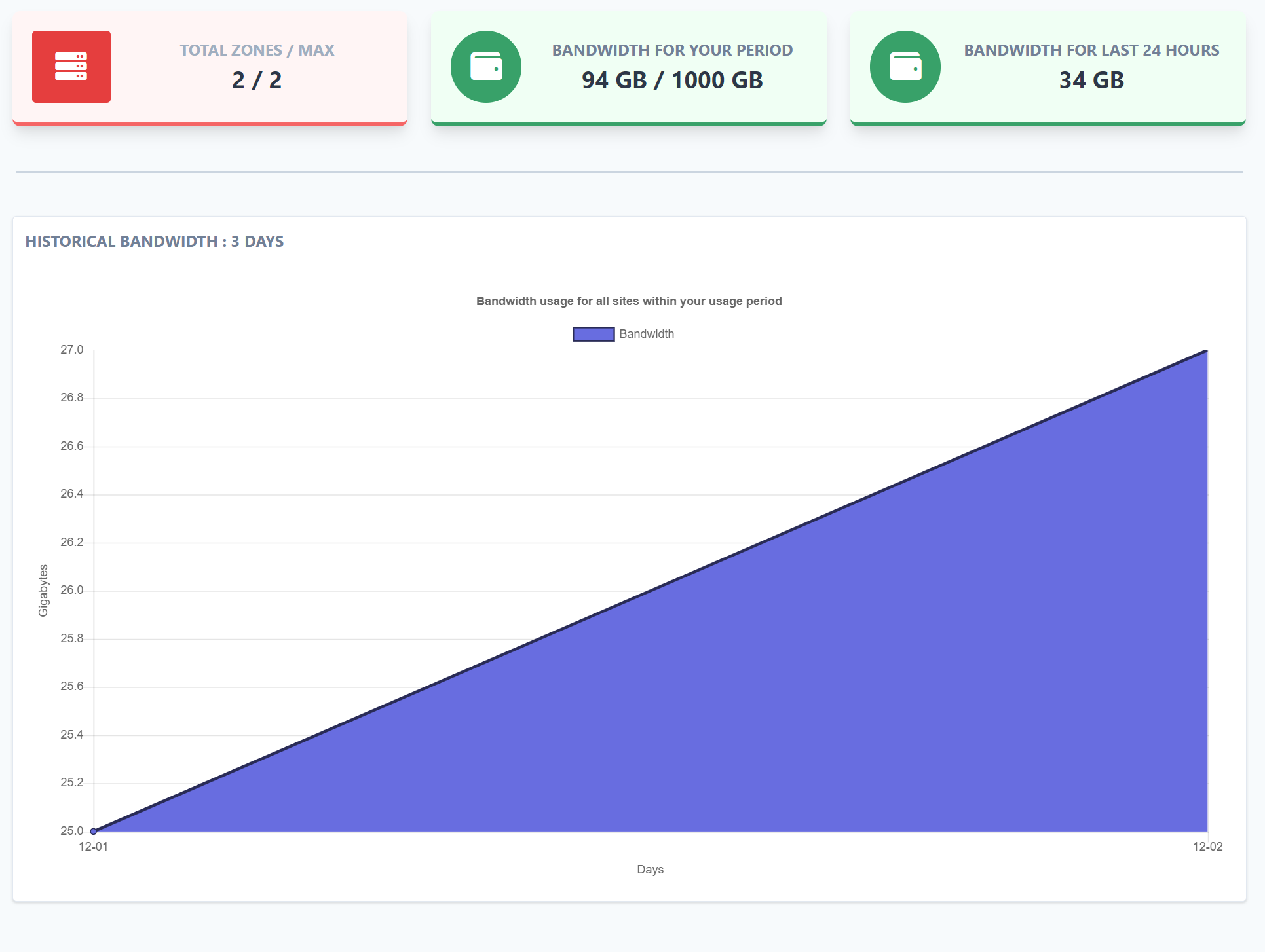
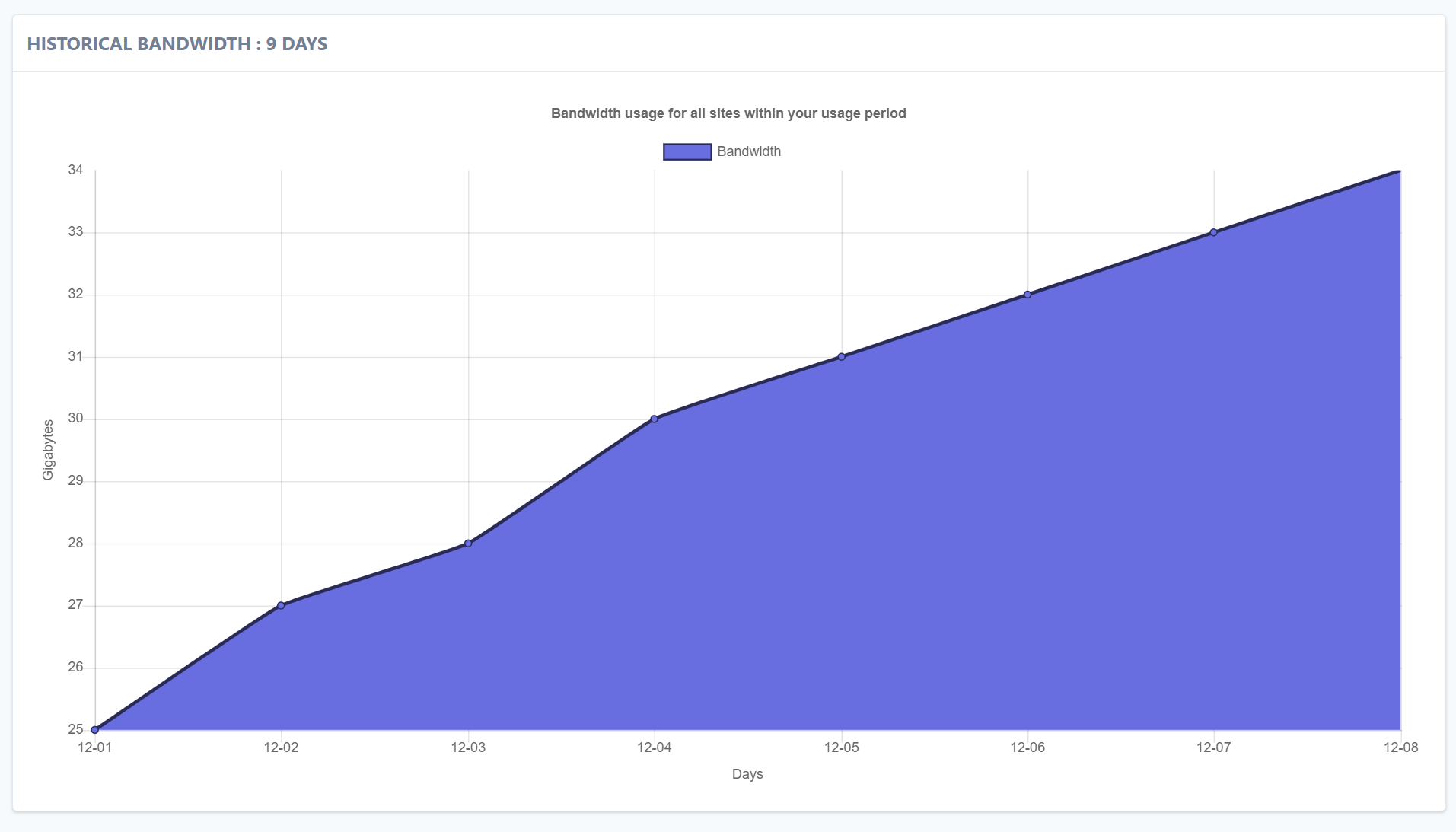
Every couple days the graph resets to zero, then spikes up to 20-30 gigs. is this actual consumption or is something wrong with the graphs? Is there a way to see more than the seemingly arbitrary time frame that the graph is displaying? I’d love to see historical per day since account creation.
Thank you for bringing this up. Ill have someone look into this today and update you as soon as we have more info
Yes I agree there is some inaccuracies happening here. The daily bandwidth overage calculation and email alerting system works a bit differently than the graph that you are reflecting in your example here. That said we have temporarily disabled the email bandwidth overage alert and are going to take a ground up approach to this system to ensure reliability and accuracy are preserved.
Thanks for your help so far.